
Logo Design
I was honored when asked to provide design assistance for a new business venture an acquaintance of mine was starting—opening a fruit orchard in Colorado!
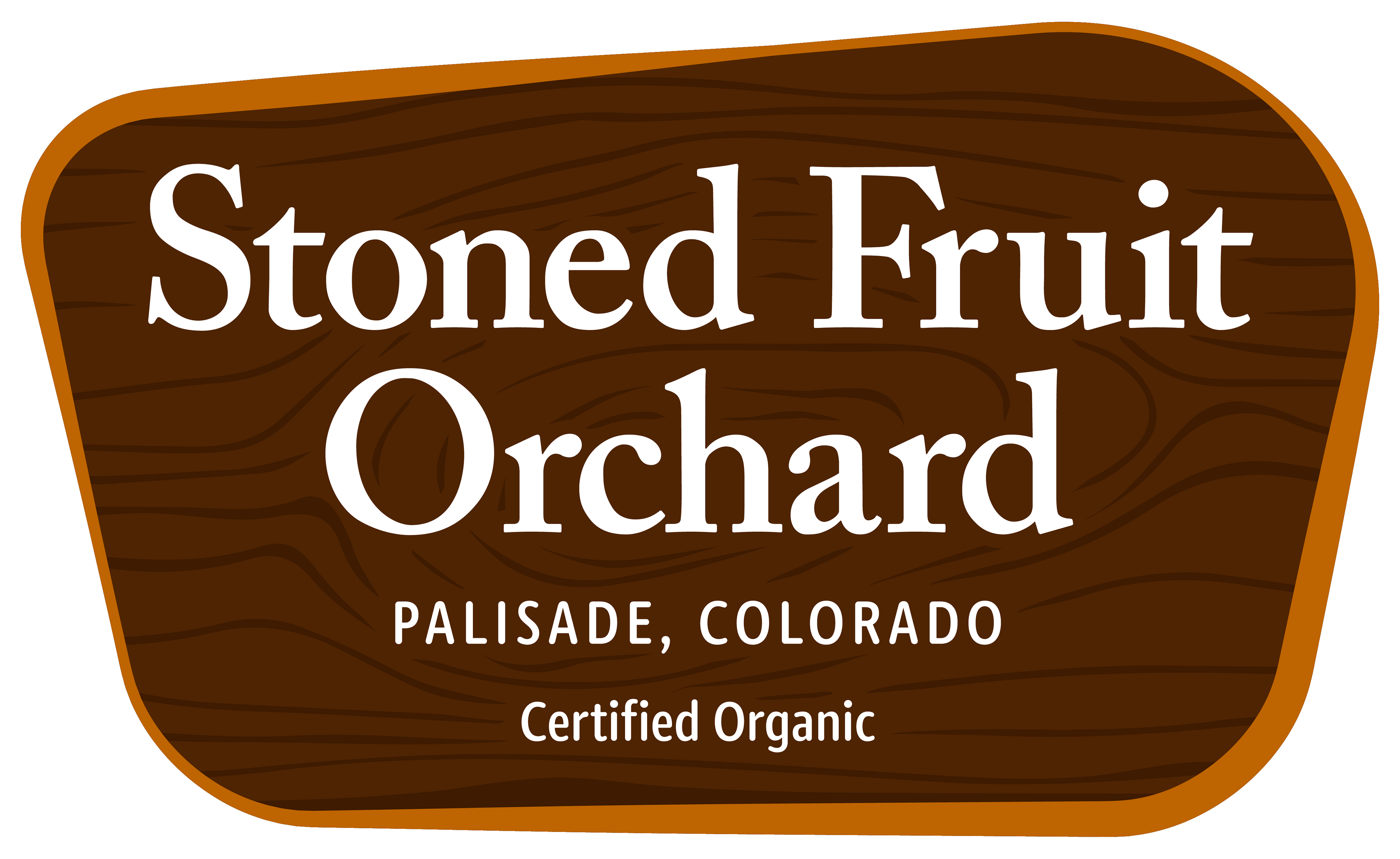
Project Overview: The project's primary objective was to craft a distinctive logo suitable for a product sticker, a crucial step requiring approval from the Colorado Department of Agriculture (CDA) before the venture could progress further. The client's vision was for the logo to mirror the aesthetics of state park signs, with a color scheme comprising brown, orange, and white.
Design Execution: To create a logo with a timeless and sturdy feel, I chose a serif font for the orchard's name. In my opinion, serif fonts can evoke a well-established, weathered, yet sturdy character—perfect for the brand identity. For the secondary font, I went with a rounded sans-serif, reminiscent of fonts used in state park signs, reinforcing the connection to the outdoors.
The primary color, brown, was chosen to symbolize the fertile ground from which the fruit springs, as well as the warm and natural wood tones commonly associated with state park signs. To infuse a touch of personal flair and pay homage to the owner's favorite color, a burnt orange hue was incorporated as the logo's border.
To lend a subtle wood-like texture without overpowering the textual elements, I integrated wood grain-inspired lines in a deeper shade of brown. The line pattern deliberately leans towards a rougher texture, mirroring the organic and natural aesthetics of real wood. This design choice added depth to the design while ensuring that the core message remained clear and prominent, encapsulating the rustic charm of the fruit orchard.
T-Shirt Series
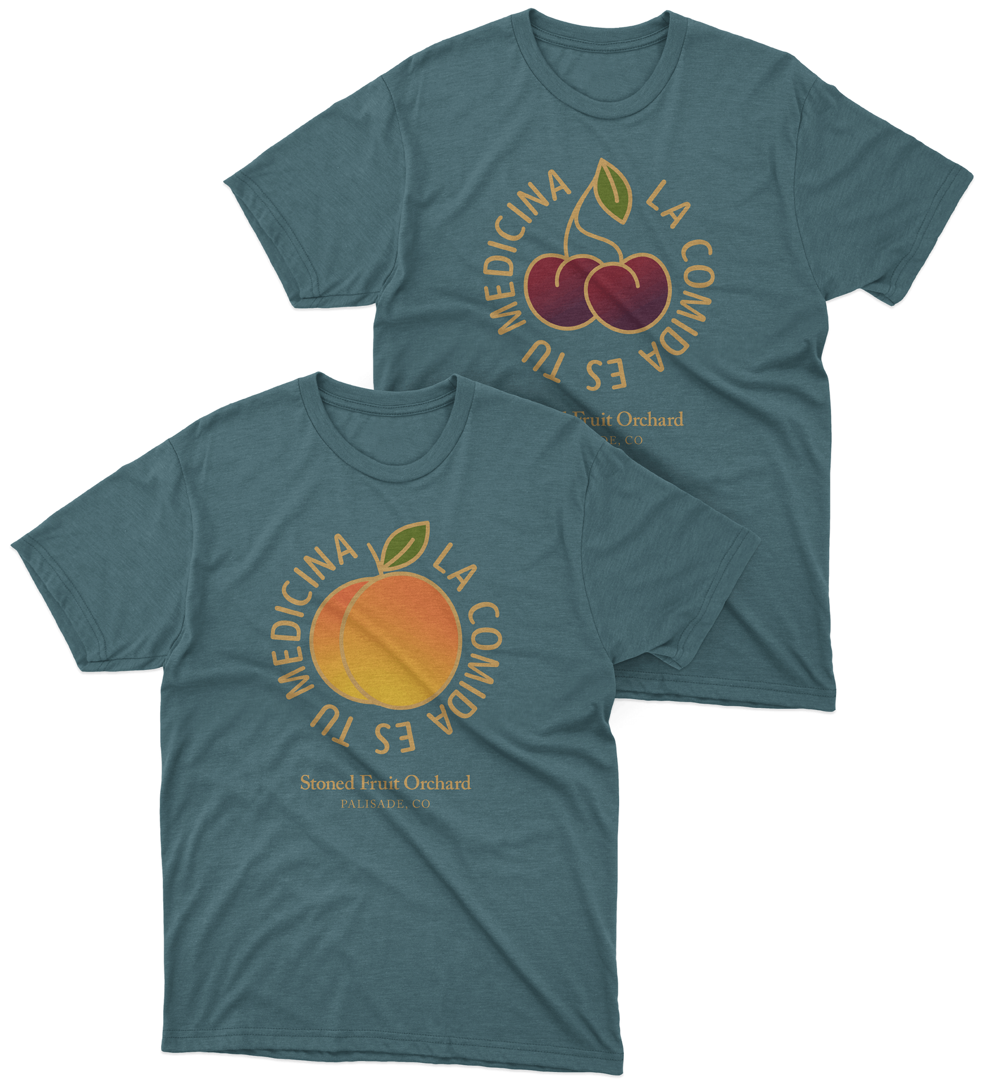
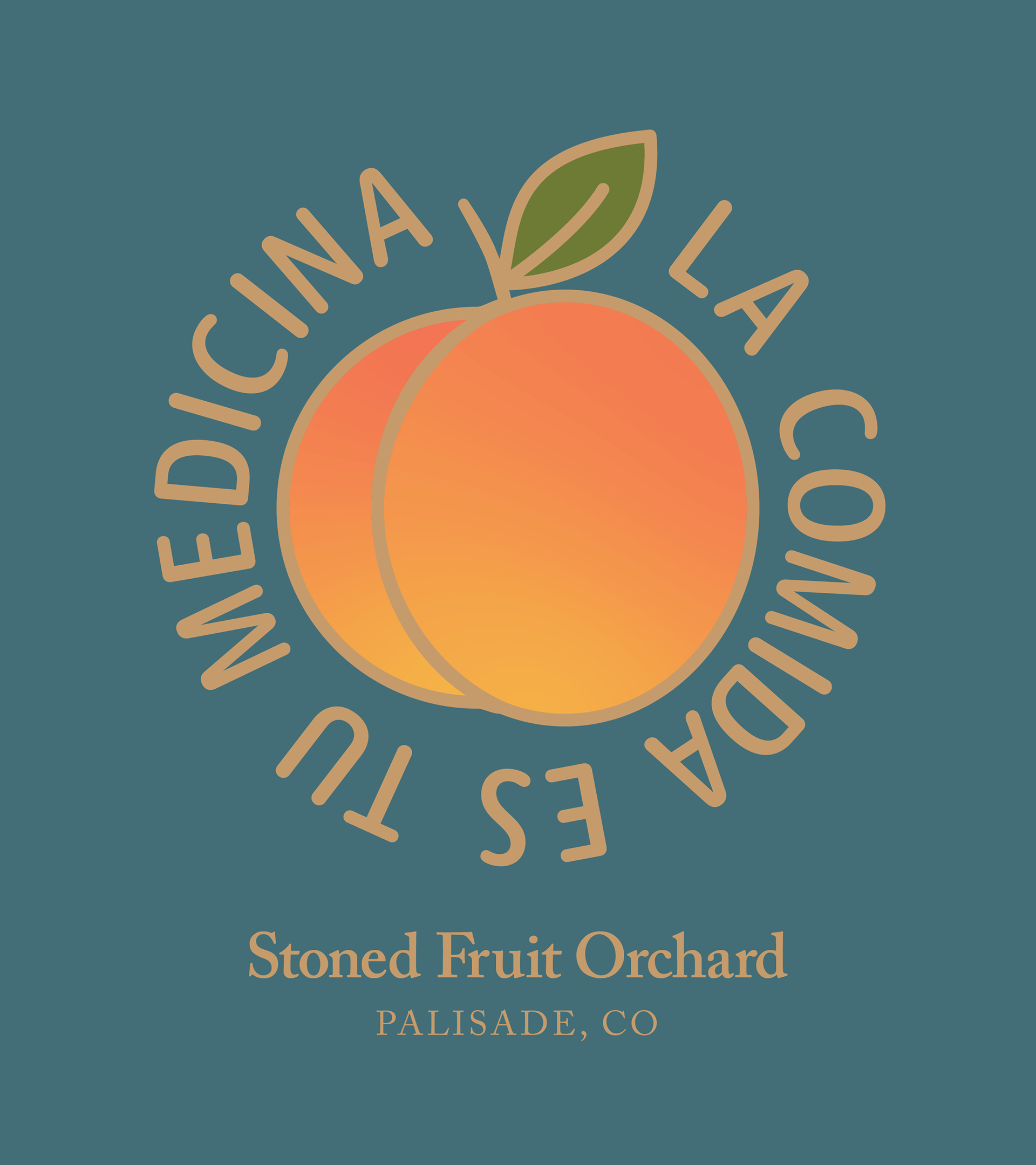
Project Overview: With the orchard experiencing a surge in business, the owner approached me with a fresh idea—to create t-shirts for his guests to purchase. The only direction provided for the t-shirt was to feature the phrase "La comida es tu medicina," translating to "Food is your medicine." This concept served as the springboard for an inspiring design, placing the spotlight firmly on the orchard's core offering: fruit.
Design Execution: Motivated by the profound message behind the chosen phrase, I saw it only fitting to make the fruit the hero of the design. Starting with a peach (the primary fruit grown at the orchard) I envisioned the text proudly encircling the fruit's contours. This approach not only celebrated the orchard's core product but also gives life to the phrase.
Anticipating that these shirts would be sought after by tourists, I made sure to include the orchard's name and location as a commemorative touch which not only serves as a memento for visitors but also works as free advertising for the orchard.
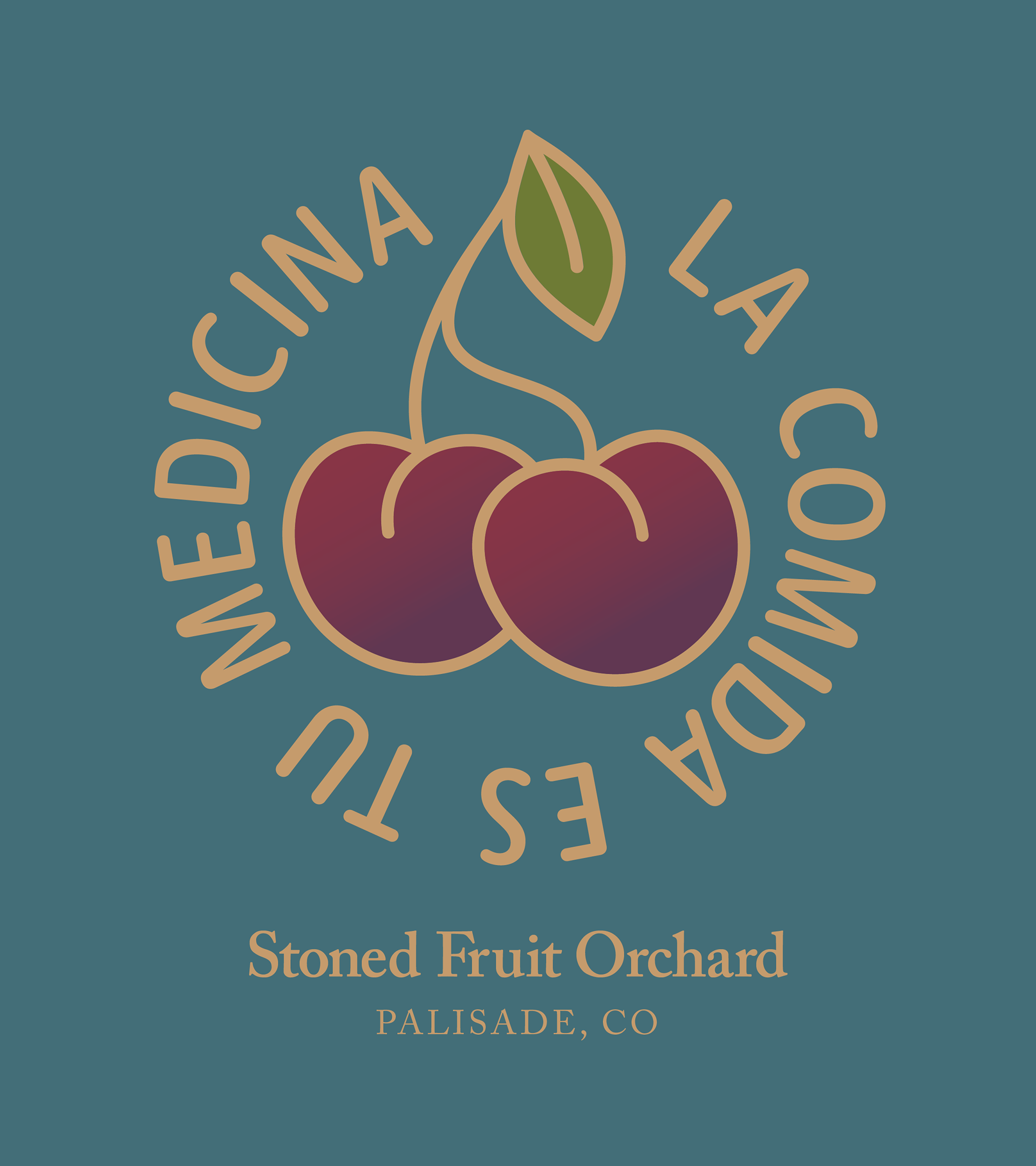
The original peach design was such a success that the owner wanted to also have one for the cherries—another popular offering at the orchard. I wanted to use the same design foundation as the peach t-shirt, so I stylized the cherries similar to the peach, using the same leaf shape, the same stroke size, similar gradient treatment and same rounded likeness.
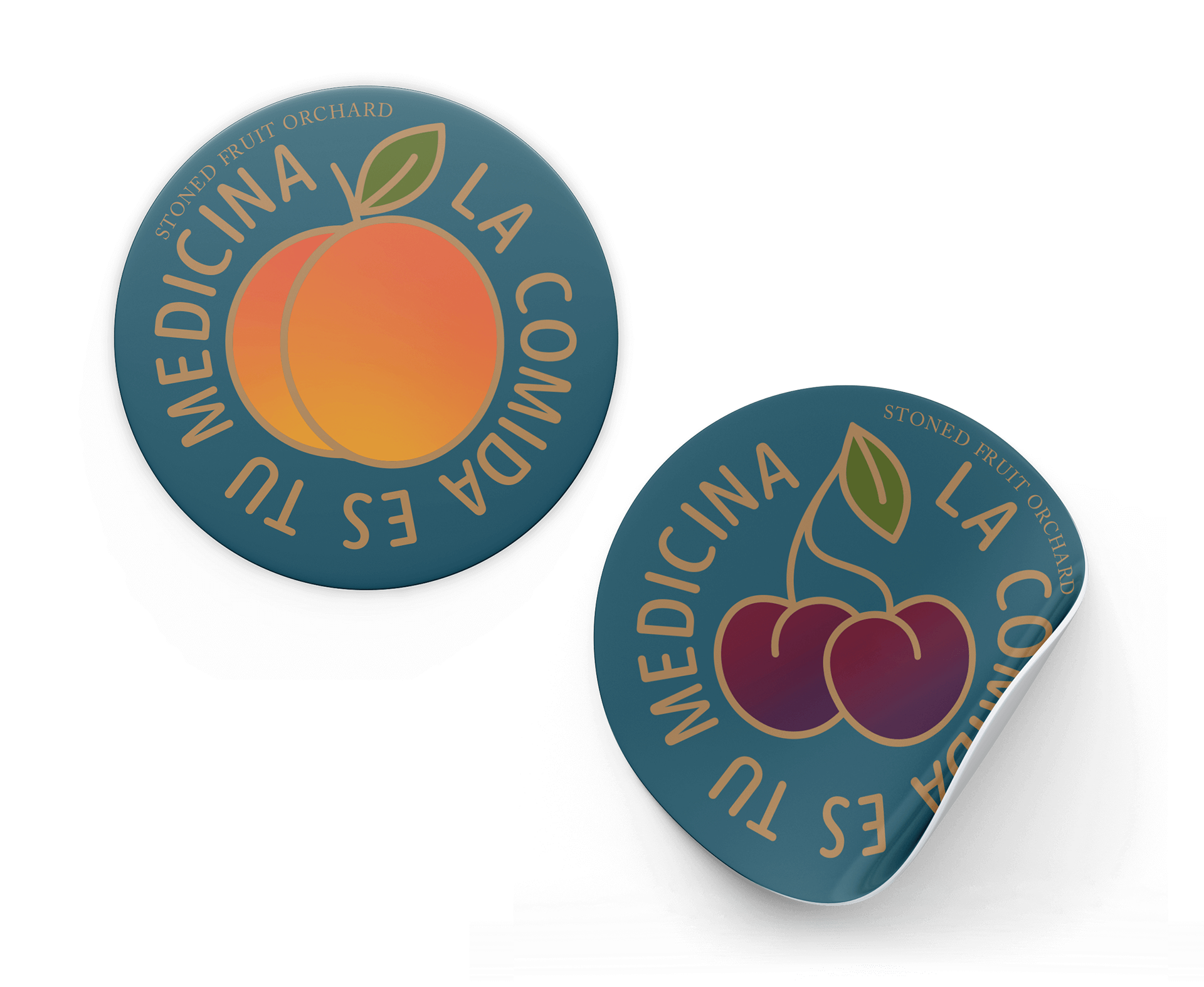
Stickers
The owner was so happy with the t-shirt designs that he wanted to repurpose them beyond just t-shirts. This included a request for stickers to accompany fruit packages in local deliveries.
I chose circular stickers for this purpose because the design perfectly suits that layout. I took care to include the orchard's name for subtle brand recognition, placing it off-center to avoid making it the primary focus of the sticker.
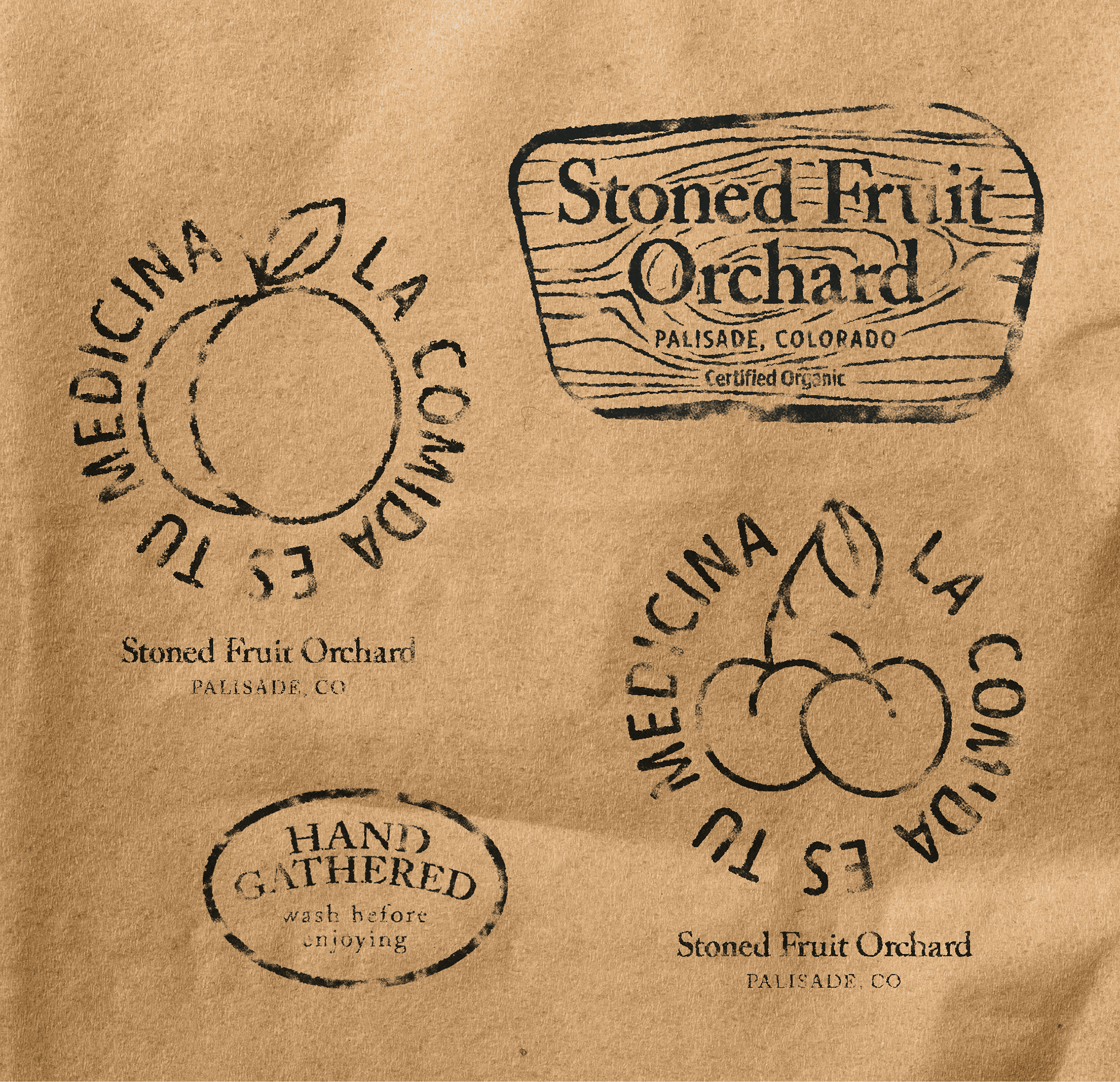
Stamps
To balance cost-effectiveness while maintaining a strong brand connection with guests, we decided to design a set of stamps for the owner to use on the generic brown paper bags when visitors come to the orchard.
I created four stamps: a simplified logo version, a small reminder to wash fruit before consumption, and stamps featuring the "La Comida Es Tu Medicina" designs.