College Commitment Graphics
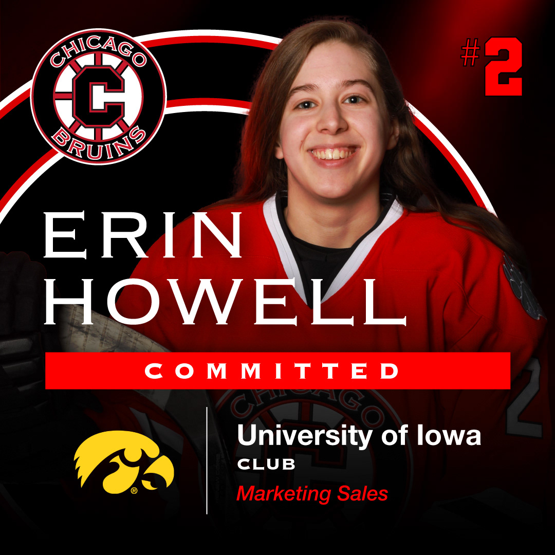
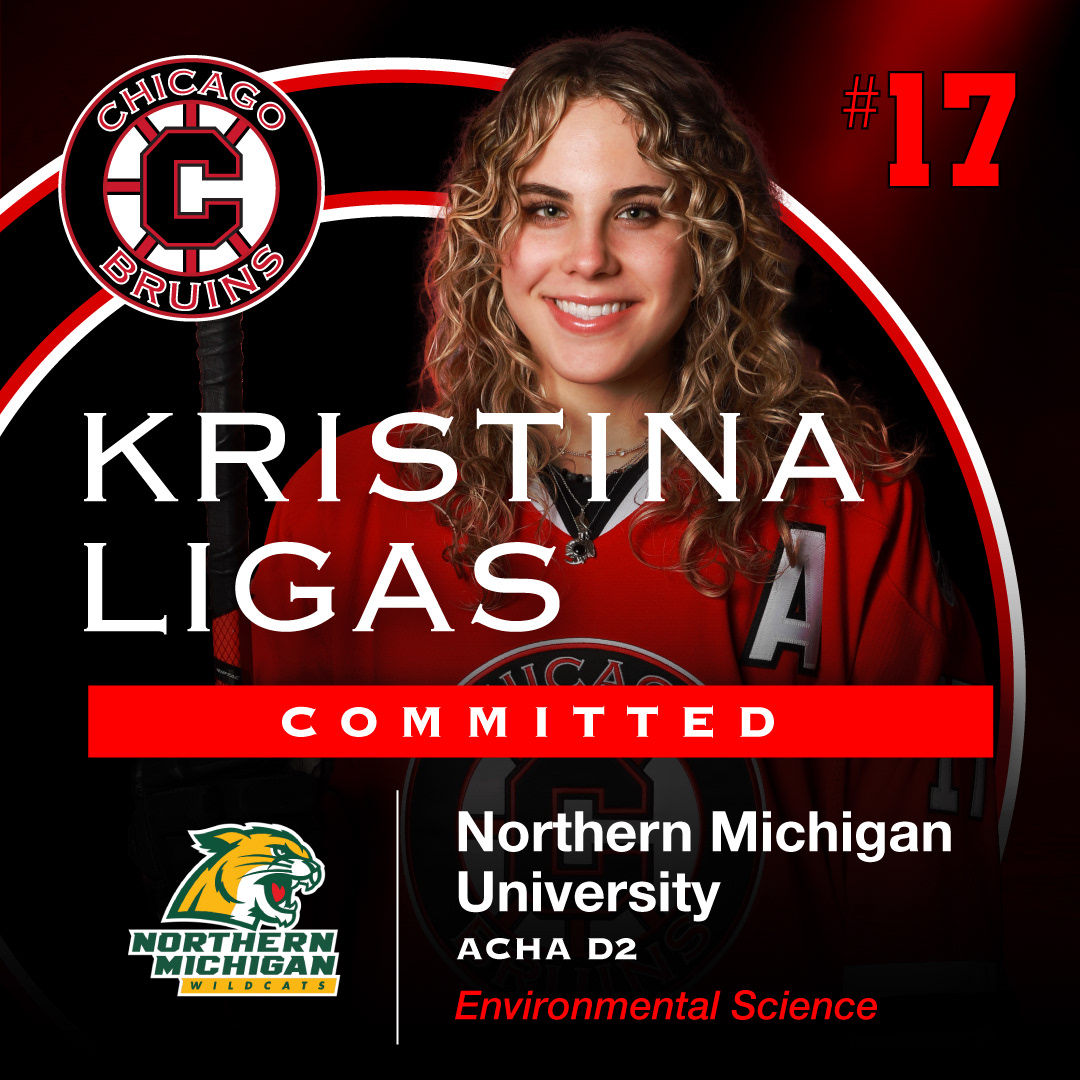
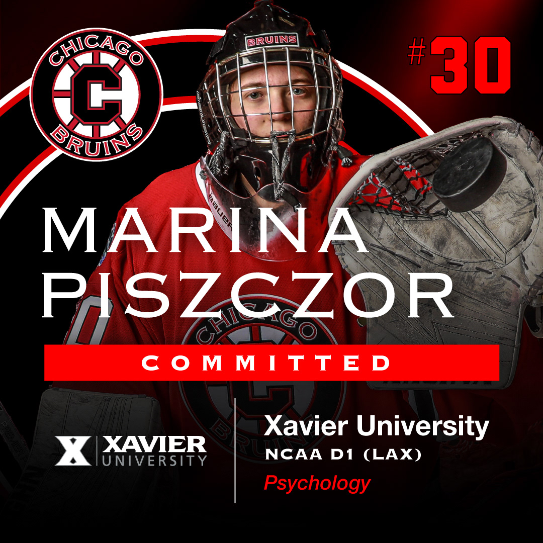
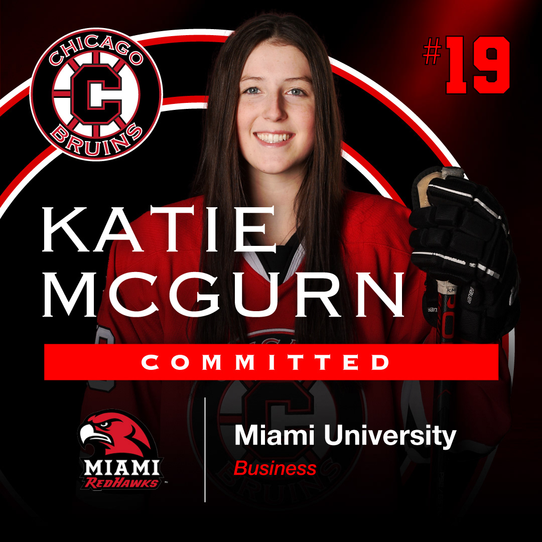
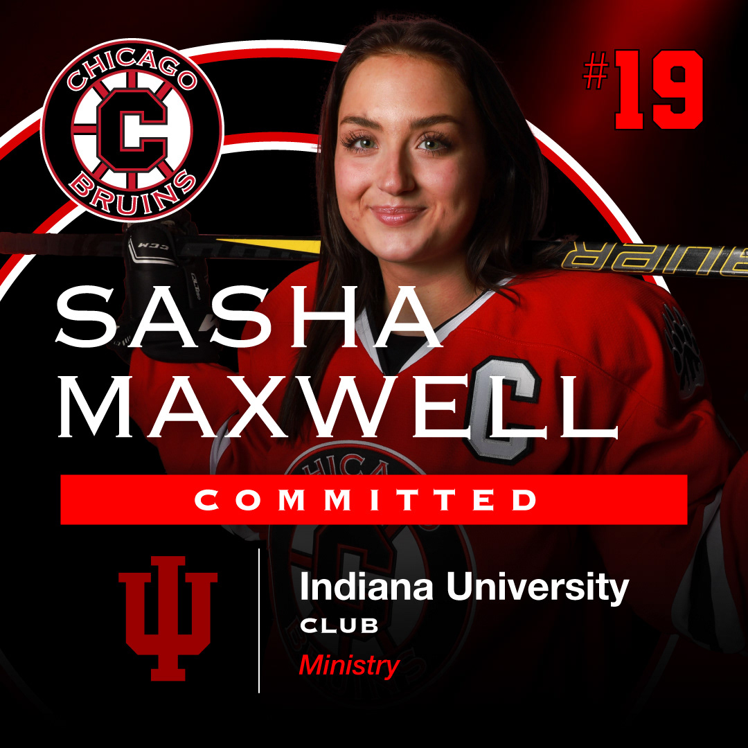
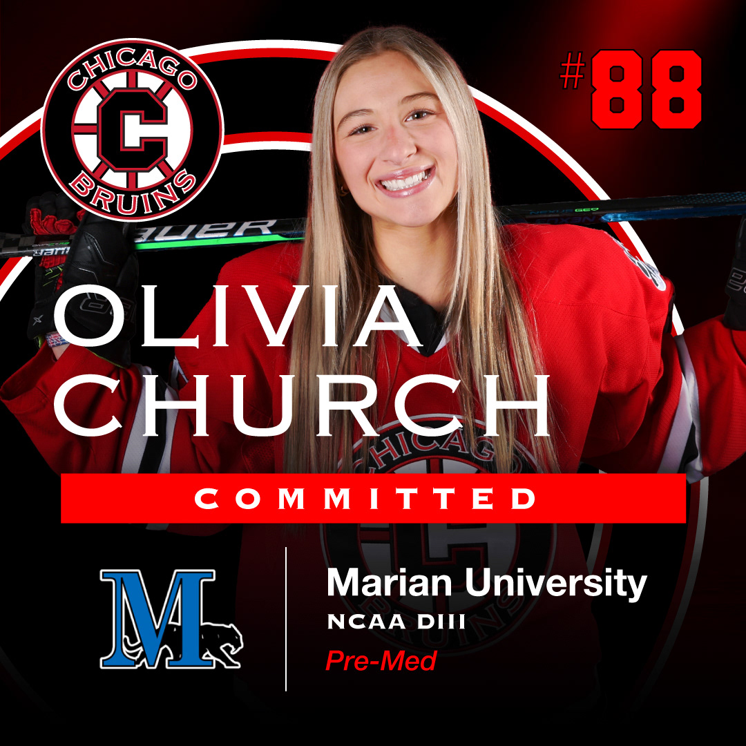
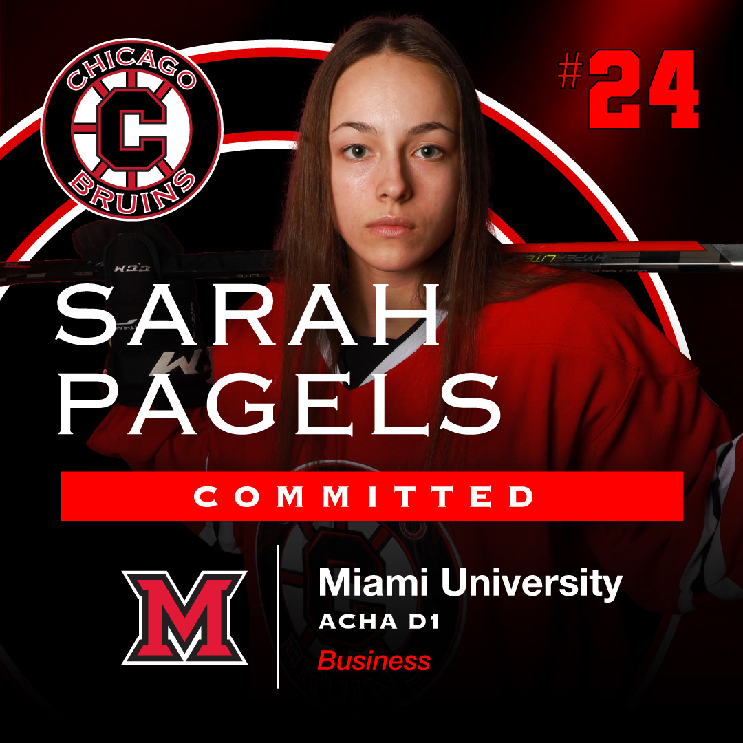
Each year, I have the privilege of crafting commemorative graphics for the seniors of the Chicago Bruins Girls Hockey Club. This project involves a blend of creativity and design precision, resulting in visually stunning and cohesive displays for the graduating athletes.
Logo Integration: To maintain a strong connection with the Chicago Bruins identity, I've meticulously integrated their official colors and font styles into the graphics.
Adaptive Template: The heart of this project lies in the development of a highly adaptable template. This template seamlessly accommodates various headshot styles, name lengths, and university information, ensuring that each senior's profile shines while maintaining a unified look.
Photo Enhancement: In some instances, the provided headshots require light photo editing to achieve the best visual impact. My attention to detail ensures that every image is picture-perfect.
Resourceful Sourcing: Additionally, I take it upon myself to source school logos when needed, ensuring that the graphics feature accurate and high-quality representations of each senior's future alma mater.
This portfolio piece showcases not only my design skills but also my ability to create visuals that resonate with the unique identity of an organization while celebrating its individual members. The Chicago Bruins Girls Hockey Club Senior Commemorative Graphics project is a testament to my commitment to excellence in graphic design.

T-Shirt Designs For 2022
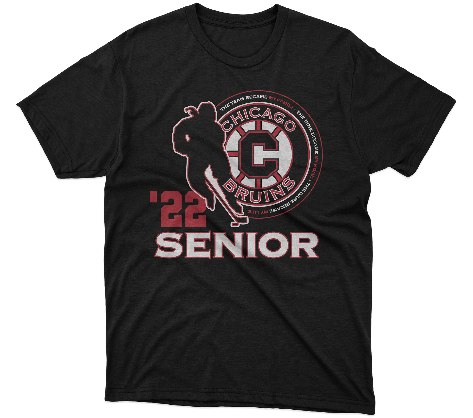
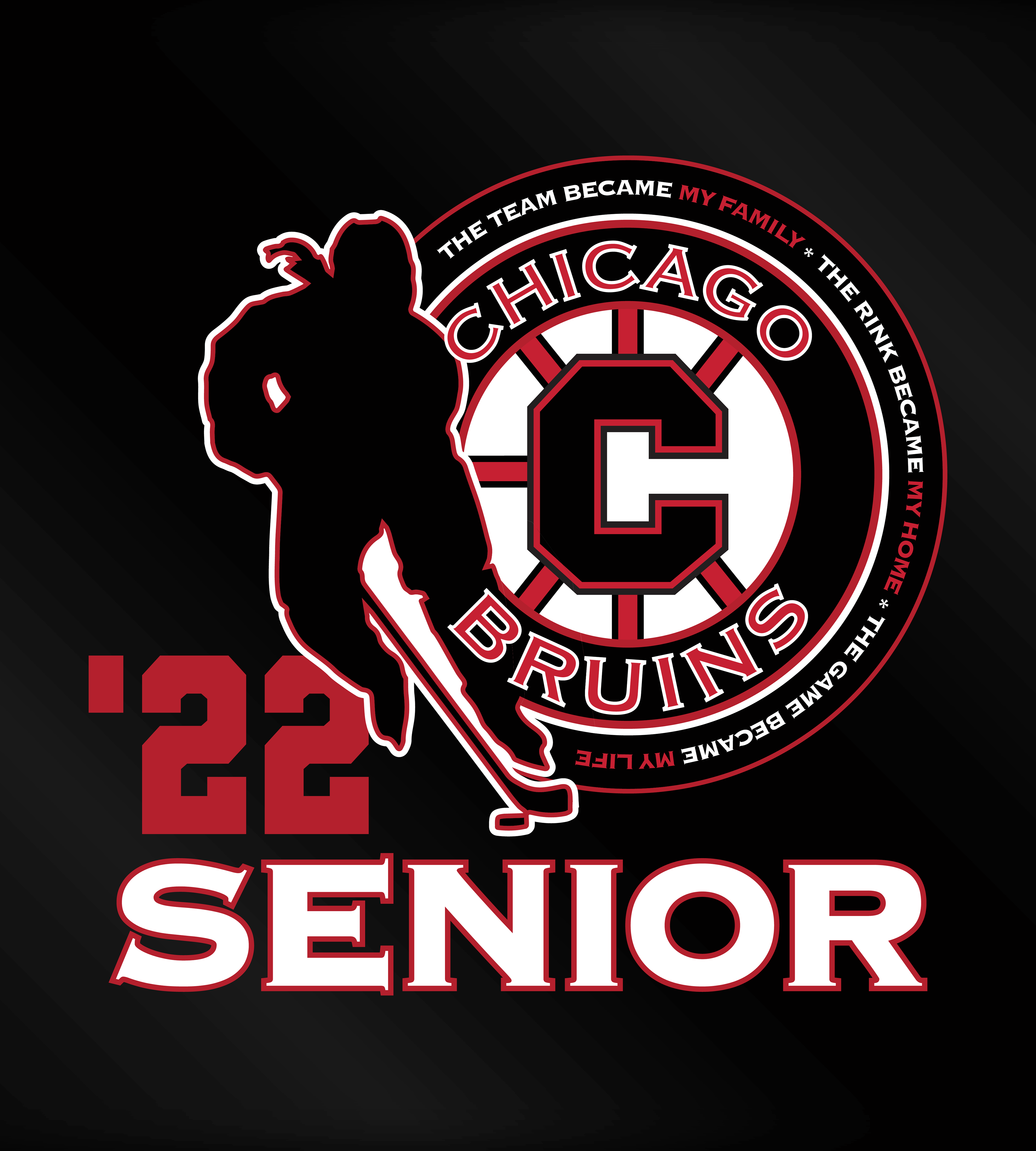
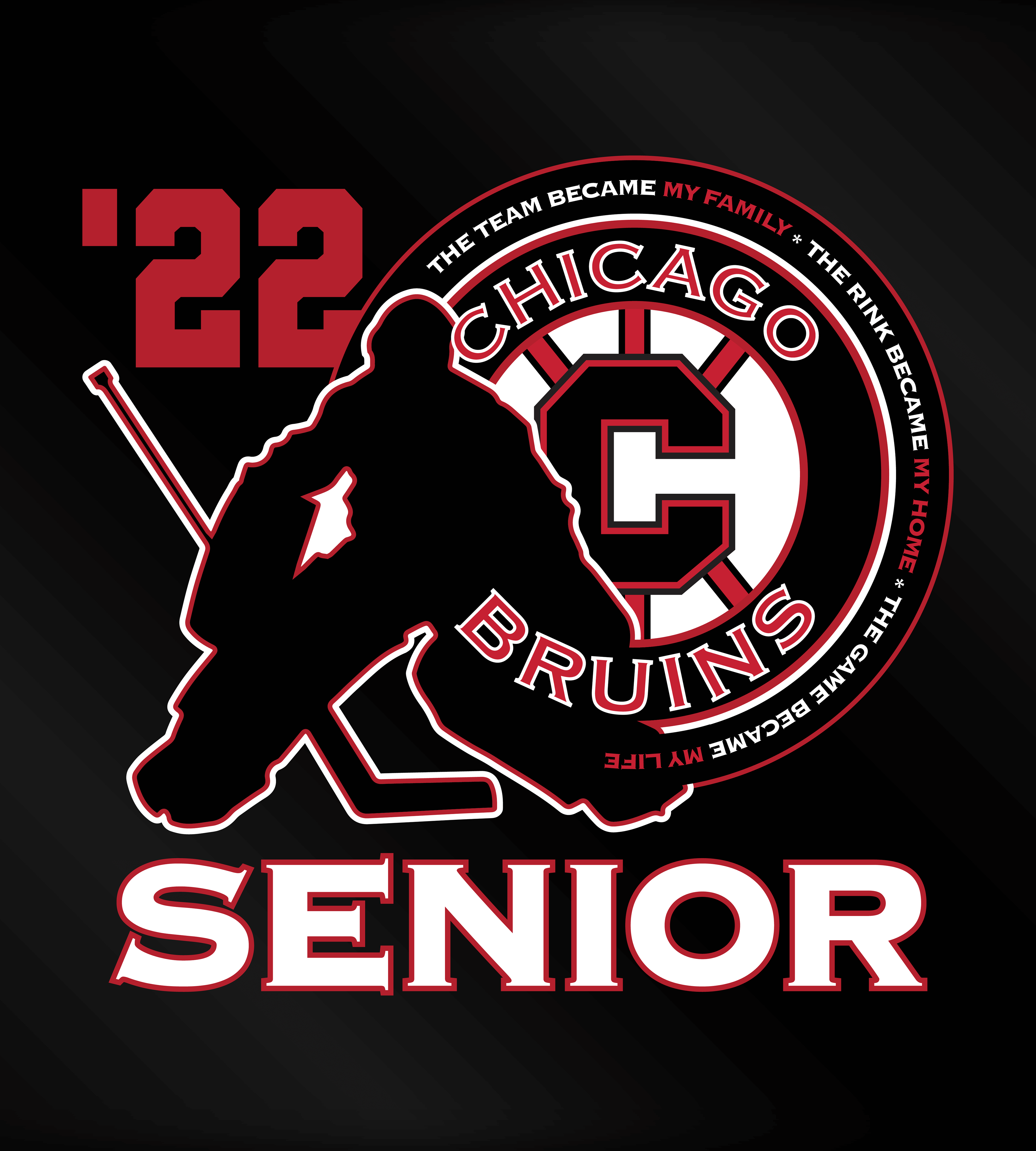
I had the wonderful opportunity to craft a collection of three t-shirts for the Chicago Bruins Girls Hockey 2022 team.
Project Overview: The project's core directive was to incorporate the impactful motto: "The team became my family, the rink became my home, the game became my life." My creative approach was all about making this motto an integral part of the iconic Chicago Bruins logo. This allowed me to create a design that deeply resonated with the club's identity and the heartfelt sentiment behind the motto.
Design Execution: I aimed to capture the essence of the Chicago Bruins Girls Hockey Club's passion and dedication to the sport. The player graphics intertwine with elements of the Chicago Bruins logo, creating a visual synergy that embodies the spirit of the game.
These designs are a testament to the Chicago Bruins Girls Hockey Club's identity and their profound connection with the game they love. They serve as a visual reminder of the enduring bonds formed on and off the ice.

T-Shirt Design For 2023 Nationals
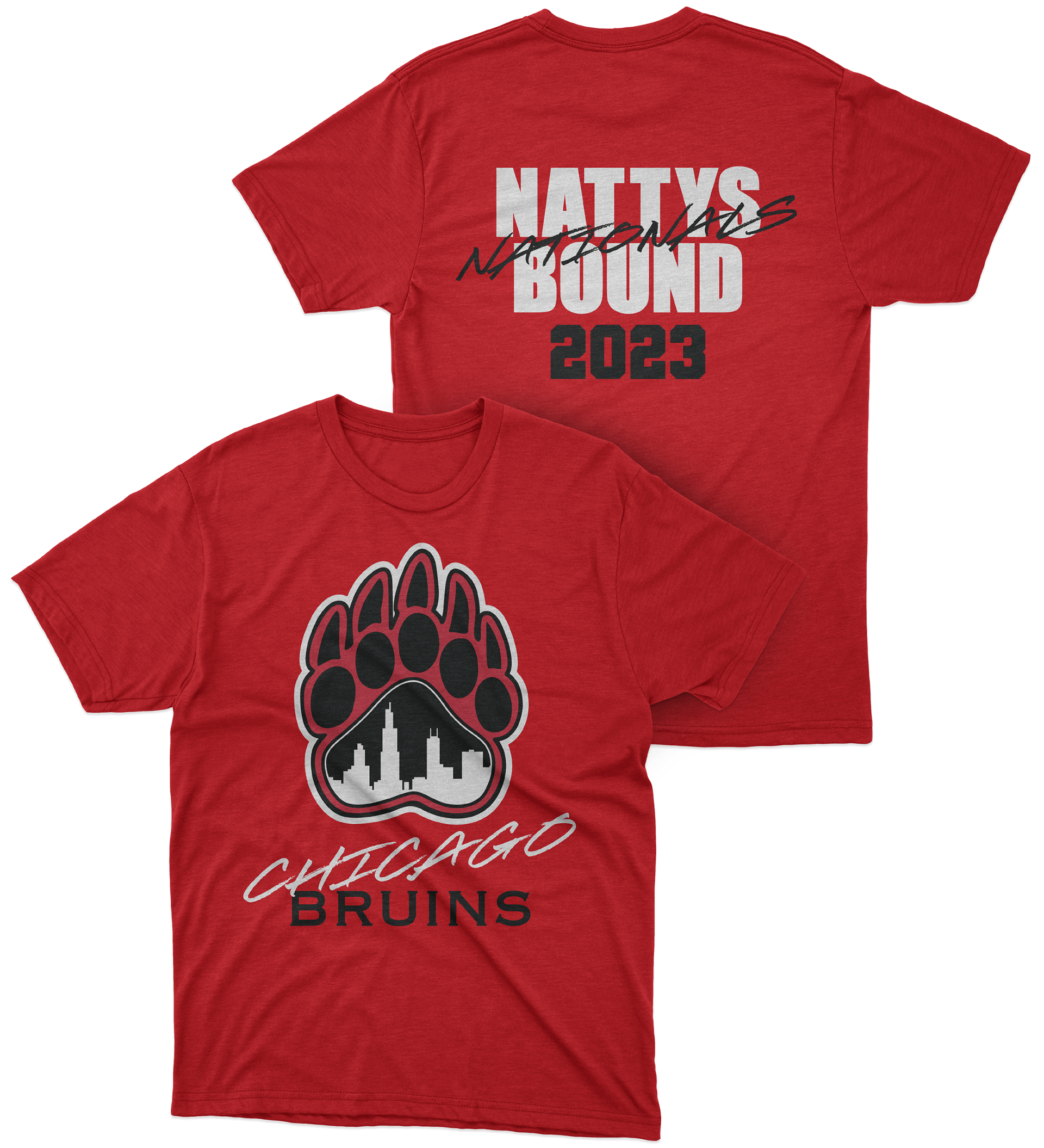
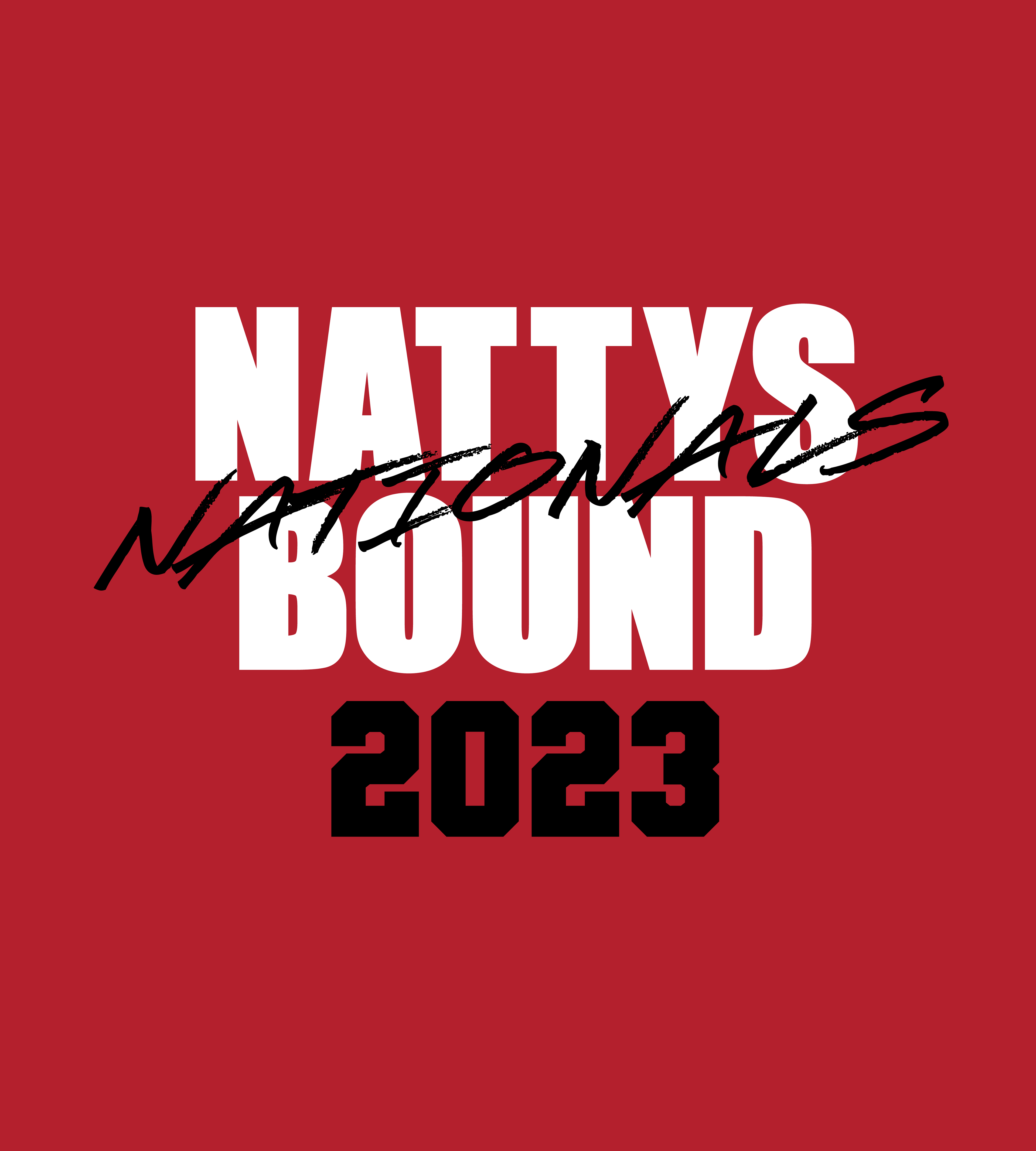
Project Overview: When the Chicago Bruins secured their spot at Nationals, they wanted a commemorative t-shirt that the team could wear while traveling to the game. The director had a specific vision in mind: to incorporate the old Chicago Bruins logo. However, we faced a challenge as there was no high-quality file available. With just a low-resolution screenshot of a portion of the logo, I undertook the challenge to bring this emblem back to life.
Design Execution: To begin, I scoured the internet for a complete version of the logo, which would serve as my reference as I rebuilt the design for print use. This phase required a keen eye for detail and precision to ensure the logo's authenticity was maintained.
In addition to preserving the traditional Chicago Bruins aesthetic, I wanted to infuse the design with a sense of excitement and strength, perfectly mirroring the emotions of the team's achievement in making it to Nationals. To achieve this, I introduced a stylish script font, thoughtfully blended with the go-to Chicago Bruins fonts. This combination added a dynamic element to the design, setting the stage for a powerful visual representation of their accomplishment.

Logo design For Off-Season Club
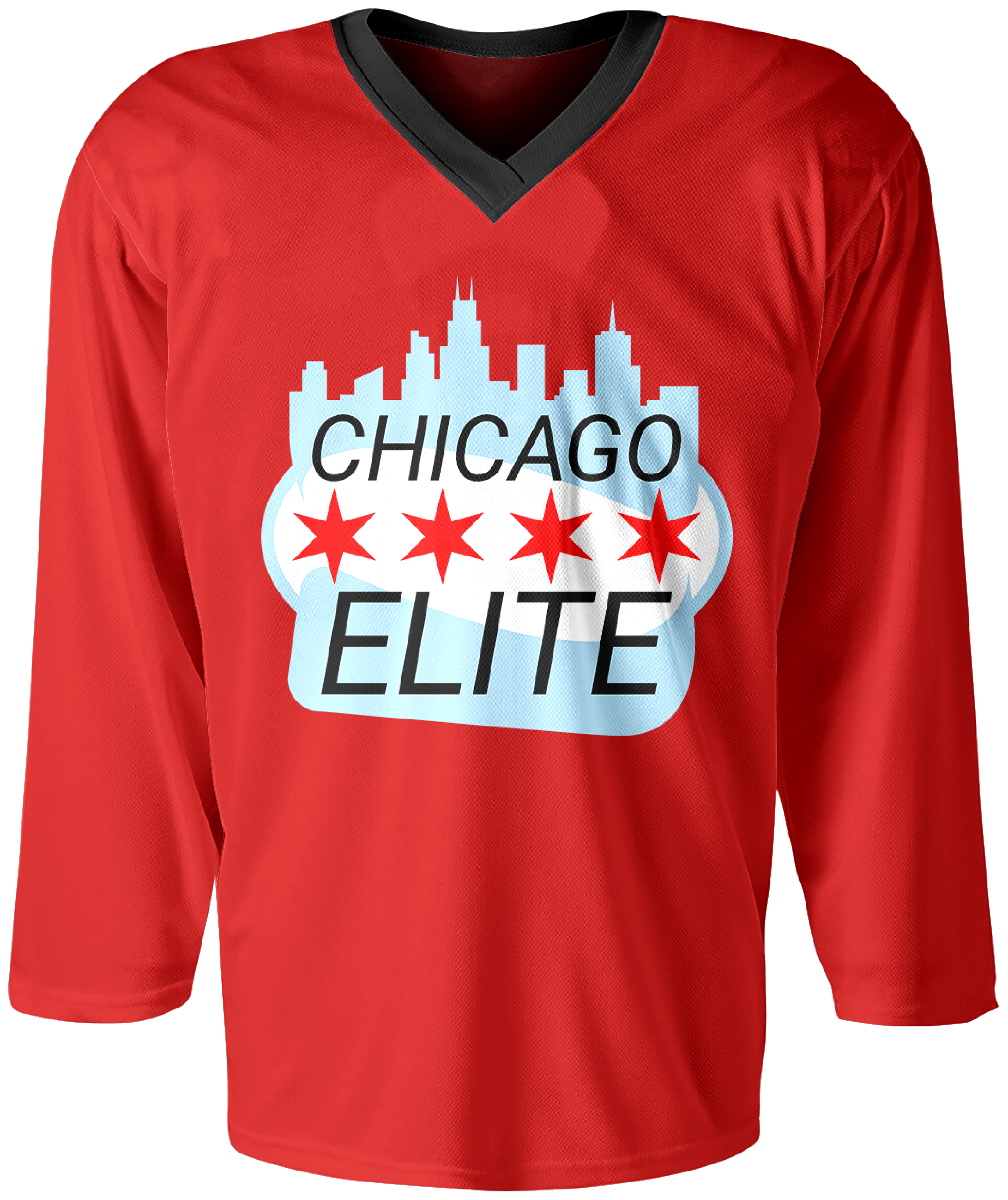
During the off-season, the girls who play for the Chicago Bruins cannot play under the same team name, so the director of the organization reached out to me for a logo for their new off-season team called the Chicago Elite.
Project Overview: During the off-season, the girls who play for the Chicago Bruins cannot play under the same team name, so the director of the organization reached out to me for a logo for their new off-season team called the Chicago Elite. The only direction given was "I'm thinking something with skyline or flag."
Design Execution: I chose to incorporate both the Chicago skyline and elements of the Chicago flag (colors and stars). The oval shape in the middle is a nod to the Bean (a well-known sculpture in Chicago's Millennium Park. The bottom portion under the word "Elite" mimics the shape of the head of a hockey stick. The rounded blue corners into a crisp point are a nod to the shape and movement of a flag.
