

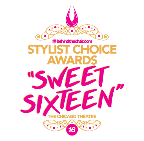
This was the logo for a prestigious beauty industry awards show. The teardrop symbol stays consistent every year, but colors and fonts change each season. 2017's theme was bright neon colors. 2016 was the 16th year, so the theme was "Sweet Sixteen". Tiaras were handed out to all attendees at the show, so the logo has a subtle nod to a tiara, which also resembles the vintage vibes of the theatre it was held in. The 2018 logo was not used because the show was not held that year—but the theme aired on more grunge, DIY—therefore, I wanted the letters to appear collaged together.